20 steps to For Improving Print Advertisement

Print advertisement is proven its capability over the centuries. It will able to drive people to your business and boost sales. Print advertisement includes the advertisement which you publish in newspaper, weekly and magazines. These advertisements are a little bit costly because of the effort involved in preparing the physical print media and circulating it to the end consumer. But it provides an opportunity for the customer to spend enough time with your advertisement. These unique characteristics increases the conversion ratio for effective print advertisements.
Creating an effective print advertisement requires good efforts. It requires lots of creativity, understanding about consumer psychology, knowledge about colour combinations and moreover your brand philosophies. If you feel that your print advertisements are not up to the industry standards, focus on the below points for Improving your Print Advertisement. It will help you to make tour ads stand out in the crowd and increase your business.
1. Use Effective Headlines
An attractive and powerful headline is the most important element of a good print advertisement. It will grab the readers attention and increases the probability of conversion. An effective heading should be simple, short, easy to understand and connect with the curiosity of the customer. Never try to explain the details and facts about your business. If you have much information to convey, then makes into subheads.
2. Shape our Subheads
After your headline, the remaining content can be divided into subheads and body parts. Your secondary information or the explanation about your title can for formed in subheads or body content. But all ads do not require a subhead and always try to keep your body copy as short as possible.
3. Use Images Wisely
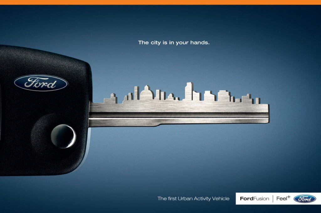
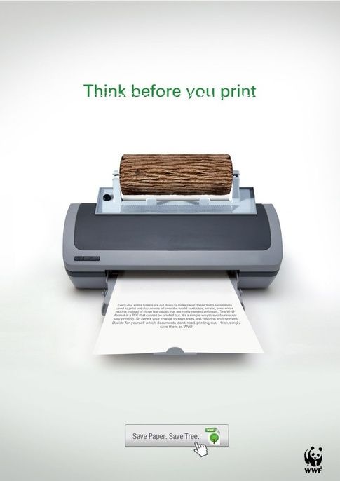
Always remember that a picture says more than a thousand words. Images will grab attention more quickly and easily rather than text content. An attractive image is the second important element after heading. An image using in a print advertisement should be unique and distinguish your advertisement from that of your competitor. It should complement your header text and overall content of your advertisement.
4. Keep Enough White space
Many Businesses try to fill every inch of their advertisement space. This will result in making your advertisement very cluttered and make it less likely to be read by the viewer. Try to keep enough white space with minimal content and make it visually appealing to get attention to your message.

5. Keep it Simple
Simplicity is one of the keys to a successful advertisement. Choosing fancy font, texts, images, and fancy language can ruin the beauty of your advertisement. Great advertisements will never be crowded with text or images. A creative title with simple body text and content will keep your advertisement easy to read and comprehend.
6. Make it Memorable
Greats advertisements should leave a long-lasting impression on the viewer’s mind. It might be a creative image or catchy tagline, which leaves a strong impression in the reader’s mind and influence even after a long time.
7. Insist the user to take an action
A strong all to action can create some urgency in the reader to take some action. An effective call to action will able to increase your ROI drastically. A call your action can be a limited time offer, a coupon code with an expiry date, or an instruction to visit the website.
8. Use the color psychology
Colors plays an important role in a print advertisement because colors are directly connected with the emotions of the readers. Bold and Bright colors will good to grab the attention of consumers but sometimes it will distract the attention from the main message of your advertisement.
Blue is associated with honesty and loyalty. Green reminds us of growth, vitality, prosperity. Yellow represents fun, happiness, optimism. Red has particularly strong energy, stimulating our appetite and even sexuality. You can use different hues and shades of the primary color which you have chosen to make it more attractive.
9. Use the Correct font
Make sure that your font and font size is consistent throughout the design. You should be careful while selecting the typeface, size, thickness, etc. which matches the overall tone of the communication. Fancy or Italic fonts will create an informal feeling in the customer. which will be suitable for. Try to use regular fonts in business communication.
10. Proper use of your brand logo
A Brand logo is a must-have element of any advertisement. But never make a logo as the most important thing and stands out in your advertisement. It should be well placed at proper size make to feel like an integral part of the overall design.

11. Think about your target Group
Always remember that your advertisement should be appealing to your target customer group. Many of the advertisements I have observed will be appealing to the company CEO and the designer. But fail to grab the attention of the specific customer group.
12. Publish along with the relevant content
If you really want to increase the effectiveness of your advertisement, make sure the ad will be published along with the relevant content. An advertisement for a new car should be more appropriate in an automobile magazine rather than an educational magazine.
13. Make it easy to connect with you
The purpose of every advertisement is to drive more business. In Print advertisement also make sure that you have placed proper information for the potential customers to contact you. It can be your company name, website, email, contact number, and your street address. But this may not be required for well-established brands.
14. Just Describe USP
Print advertisements should be crisp and precise. It is not the place to describe all your features and benefits. An effective print advertisement should be created around your most important unique selling point. It should distinguish your product and service from that of your competitor.
15. Your ad must me Unique
Every business owner wants to make their product and service unique from the competitor. But what about your advertisement? You should ensure that your advertisement also unique enough to get noticed by the reader. Normally advertisers try to get a unique proposition and identity for each brand.

16. Maintain the balance
Every attractive design should have some sense of balance in it. Rule of thirds will always help to create some balance when you are using images in the ad. This rule states that if you divide the image into thirds, you should center your main focal point on the outer vertical line and center it on the horizontal lines.
17. Don’t Get too Fancy
We could not measure or define someone’s creativity while designing an advertisement material. You can definitely try creativeness in content and images. But should not be in using comic fonts and fancy images. Don’t make your advertisement difficult to read and understand.
18. Get to the Point Fast
You will have a lot of points to communicate to your reader. But never try to include too much content limiting your customer from reading it. The objective of your advertisement can be selling the product, building brand recognition, or driving people to your store. Whatever your objective is, try to communicate your message right in the title itself.
19. Relates with existing brand creatives
Your new advertisement should have connected with your existing creatives. Otherwise, people might find your advertisement is interesting but fail to relate to your brand. The more consistent your advertisements are readers will be able to recollect even without even seeing your logo and tagline. If you could able to follow a consistent design across your products and advertisements in various media, the more the recollection will be.
20. Never stop testing
Like any other form of marketing, you should continuously test new designs and contents. You may not need to completely redesign your time. You can test various components of your ad to increase the effectiveness. If you identify your heading is weak and make an improved headline, then you simply increase your effectiveness by 5% to 10%. Similarly, you can test and improve every element of your advertisement.

Read More about basic elements of print advertisement : https://vijinv.com/five-basic-elements-of-effective-print-advertisement/